Monday 14 July 2008

Winslow Japanese art review


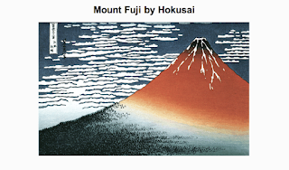
Reviewing year 6 Japanese woodcut paper designs using the web cam, making use of the project guidelines:

In order to be a successful Japanese Woodblock, your design should have the following features:

A clear design which uses most of the space in your rectangle.
A simple design which will be manageable to cut.
Some detail to show what the design is but not too complicated.
A design which links to the overall Japanese art theme.
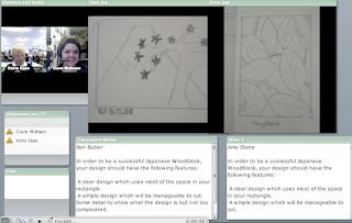


Last month I met Winslow students online via the web cam, one at a time to talk about their initial pencil designs for their woodblock project. Photographs were taken of their work and uploaded on Breeze for viewing during the meeting. Students introduced their work and explained their design choices. I offered my thoughts about each design, making suggestions about technical and aesthetic points to consider; potential problems with small and intricate designs, making space within the work, building up texture, adding a variety of marks within the design.
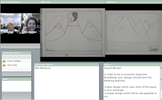


This design and making of the woodblock is one part of the year 6 Japanese art project this term. It's been a real insight to be involved in this project because its been set and managed using Winslow's VLE (Virtual Learning Environment). This makes it an ideal project to incorporate a web cam meeting such as this one. Student's had already begun to review each other's work online, creating forums and offering advice. My input was a clear, appropriate step to include, acting as another resource and voice for the project, opening up the project beyond the classroom and school itself. Wikipedia on VLE
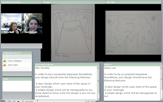


Here are a few comments posted by students in their VLE forum, about each other's work-referring to uploaded images of the pencil designs which I had also reviewed with them.

''I like the tree in the middle of the picture as it makes you think about it more and the flowers in the background are pretty to.''
''I like the big tree and the flowers and how the tree is seen as the main thing. It may be a quite difficult to cut out though.''
''I like the way the tree is the only thing in the picture (apart from the flowers which are very pretty) so it makes that the focus. i like the way the shape is abstract and the wavy lines which make it look more real''

And some thoughts from them about working on a project which makes use of the VLE.
''I think the vle has worked really well along side the written work we have done, it also makes it a lot more funner for us to do.It also makes a difference from doing written work all time.In my opinion i would like to use the vle along side the classroom work more often.''

For more information about VLEs, have a look at Ian Usher's blog:
Changing the game?

Thursday 20 March 2008

Chalfonts 2nd visit

photographing 2d work with back lighting

Last week I visited year 12 and year 13 A Level groups at Chalfonts Community College led by Mr Hodgson. Some students I had met before in my last visit to the school and during online meetings. This visit would conclude my Virtual Residency Project work with Chalfonts. It was a chance to discuss their exam paper, the year 12 title; Links and Connections and year 13; Transitions.

The session with each group began with my own view of the exam paper. I offered some thoughts about how I might tackle the project, which artists I'd looking at, materials, subject matter, development ideas. Using a past sketchbook as work examples, I talked about the importance of being lose with the project. Not labouring over each page in the sketchbook, gathering quickly and widely a volume of visual information. Annotating, keeping notes next to images in the sketchbook, working on different papers outside the book and collating later, to break up the continuous white page.

To suggest some ideas of new and manageable image making, related to the student's project, I led a group activity of experimental drawing, to be used later within a photography exercise. Students had brought with them some objects to draw relating to their project. On A2 sheets of paper and with pencils, pens and black ink, we started to fill the page with line drawings of these objects, allowing a couple of minutes for each viewpoint of the item. A different drawing tool was then selected and more drawing continued over the same page, crossing over previous lines and marks.


This process was continued with pens and black ink, applying the ink with sticks and cardboard edges to achieve different qualities of mark on the page. As a final action, sunflower oil was the painted onto the page, being selective about how to paint the oil within the picture. I asked students to consider filling in negative spaces, bulky shapes, flat areas in the drawing as well as outlining dominant lines to accentuate the developing composition. The oil was applied to make the page translucent.

Students held their work against the light to check drawing progress.


This drawing activity was quite speedy, completed within 15 minutes, not being too precious with accuracy and arrangement of shapes on the page. It was a way to record a range of marks, inspired by the subject matter, which would be interesting to photograph.

The translucent areas of the drawing create a great filter/layer to photograph through. Drawings were attached to the edges of the desk, and light sources placed under the desk to back light the drawing surface. The light accentuated the marks on the page, particularly the areas of painted oil. The black ink providing a brilliant contrast the light oil areas.


Within the drawing, students selected interesting areas to zoom in, crop, compose, small marks becoming dominant within the camera composition. The items chosen to draw could be included in these compositions, by placing the object behind the drawing. The back lighting created effective silhouettes against the paper. Items like plants, glass, hats, keys were incorporated.

Other translucent layers/filters were added to these lit drawings. Surfaces like bubble wrap, netting, light fabrics and clingfilm. This provided further texture and mark to the overall surface.


net curtain layer


lightweight fabric layer

bubble wrap layer


Student's drawings could also be layered together to combine marks and shapes with which to photograph.


The last layer we concentrated on in this session was adding colour to the otherwise tonal compositions. This was achieved with tissue paper, scraps of plastic bags, coloured acetate and applying washes of diluted paint to the drawing itself.


This session was to help equip students with alternative ideas about creating new imagery, offer ways of making use of their gathered research, ways of combining their 2d and 3d interests, create original digital media to develop further, maybe within Flash or Photoshop. Some students began to film their drawing, while moving the light source behind the surface to accentuate different parts of the drawing.

The objective will be for these students to apply and develop some of these actions to suit their own project. Whether its creating new drawings with different tools, surfaces, light sources or finding new pathways for their project based on the outcomes of this activity.


Waddesdon Year 13 Tutorial

Screenshot from web meeting

At the end of February I met with two year 12 students from Waddesdon School. Both are completing a project towards their coursework for A Level Art on the theme of altered images, a variation on the term abstraction and possibly easier to digest as a starting point.

I have met these students online and through visits to the school over the last few months. They have been developing their own subject matter within sketchbooks, fabric and larger paintings. Each student talked through their project so far, holding up their work to the webcam. The purpose of this meeting was to provide another viewpoint for the student, outside the school environment, suggesting other techniques, materials, artists relating to their project.

The first student has been concentrating on various perspectives and enlargements of flowers, particularly roses. The centre of the flower becoming the focus , magnifying the area to fill a composition. Lots of experimenting with layers of papers, painted surfaces torn and collaged, fabric prints,combing textures together. Its interesting how this student has been concentrating on the structure and texture of the flower more so than colour, creating quite a sculptural feel to the project. This is leading to a very personal and unique interpretation of familiar subject matter. In fact constructions of the flower have been made and photographed and the results used to direct painting compositions. This continuous development of process informing the next is something informing my own practice. Building and understanding subject matter by testing a variety of viewpoints and dimensions, repeatedly.


This work reminded me of an artist Junko Mori, who creates series of small scale metal constructions, who has exhibited at Crafts Council. Both student's work relate well to the techniques and materials being used by artists from the 'Out of Ordinary' exhibiiton held at the V and A museum recently.


The second student is looking at altered images of the body. Researching artists like Christopher Townsend and Bill Brant. Arranging her own compositions, concentrating on various body parts like feet, hands and back. Again a good variation of style. These tonal black and white images are well contrasted with other painterly, colourful compositions. The challenge will be to combine these approaches together in the final piece.


Friday 18 January 2008

Winslow 3rd Visit

Work by Will

My final visit to Picasso's Ipod group at Winslow Primary school this week, concluded the ongoing work created with students throughout the Virtual Residency Project.

In follow up to the digital photography workshop in December, this session focused on developing the imagery within Adobe Photoshop (Elements). I met with the whole group of 12 students in the IT room and using the Smart Board, worked through a few images trying out various steps within the software. We stopped to discuss what was happening to the image as each step took place. Realised defining words like Hue, Saturation, Lightness vs Brightness, Contrast, Opacity, Layers are all quite meaty and needed time to explore carefully. But these words can be related well to physical objects. Layers described as a stack of individual papers, each paper representing a different layer, each layer a different image.

Students directed me on the Smartboard, deciding what direction the image should take, colour, rotation, contrast. After looking at individual images, we talked through how to fuse two images together within one file. Familiar terms like Copy, Paste, were combined with changing opacity of individual layers, revealing the image of the bottom layer.

We created a new blank layer, added 100%colour to it and then used the rubber tool to reveal sections of layers underneath. Students experimented with the opacity of the rubber tool and the rubber diameter.

After this group demonstration, students were able to access the group's original imagery and select a range of images to develop on their own computer terminal. Students saved their own work as an image developed.


Origami angel construction in previous workshop


Photographing the origami angels using lights and filters


Example of original photograph


Adobe Photoshop photography development:

Sam


James

Will

Zoe


Monday 10 December 2007

Chalfonts imagery review


Online Breeze meeting with year 12 from Chalfonts Community College. In response to my visit and online meetings, these students produced a series of abstract, experimental photography which they are developing further within Adobe Photoshop. This post illustrates with screen shots, the use of power point images being viewed within the Adobe Breeze platform. The power point file of student's work was uploaded in preparation for the meeting by class teacher Mr Hodgson, the file was then controlled by all participants online. Web cam images of myself and the class can be seen in the top left hand pod in the corner of the screen. This pod has been minimized compared with other meetings taken place online, to allow maximum viewing of artwork in the centre of the screen opened in what's called the share pod.

Meeting plan inserted into the Chat pod, centre left of screen:

>Recap on what we did a few weeks ago when we met Clare online and discussed using light and filters to make abstract images
>Crit student work - random sample
>If time discuss the way they could use image making to expand upon or develop their ideas for the current project

Curriculum info inserted into Note pod, bottom left of screen:

A01
Record observations, experiences, ideas, information and insights in
visual and other forms, appropriate to intentions.

A02
Analyse and evaluate critically sources such as images, objects,
artefacts and texts, showing understanding of purposes, meanings
and contexts.

A03
Develop ideas through sustained investigations and exploration,
selecting and using materials, processes and resources, identifying
and interpreting relationships and analysing methods and outcomes.

A04
Present a personal, coherent and informed response, realising
intentions, and articulating and explaining connections with the work

Screen shots from meeting showing student's developing imagery:


Clare's studio view, work in progress


Work in progress, textile piece Thread Wood, 1.8m x 2.2m

Displayed here with back lighting (using over head projector) to accentuate surface marks. Work makes use of abstract mono type print, paint, onion skin dye colour, applique, hand stitched on multiple layers of recycled cotton and wool.

Other artwork seen in clip:
screen print fabric samples on cotton (designs from photography of origami + other 3d paper exercises), fabric dye experiments with onion skin colour, food colouring, tie dye, origami constructions, mono type printing onto plastic and paper, A2 black and white drawings referencing Thread Wood composition

Some still images:


Origami fabric constructions with naturally dyed fabric, hand-sewn

Developing composition, fabric screen prints pinned into surface


More images viewed in gallery>>>

Friday 7 December 2007

Waddesdon 2nd Visit

I made my second visit to Waddesdon Year 12 group a couple of weeks ago. Having met the class as a group both online and on my first visit, this session I was able to talk to students individually about their current project. With self directed briefs such as urban environments, students have been building up sketchbooks and starting to move onto large scale work in paint, fabric, collage and photography.

I was able to follow up in depth and in person, a dialogue started online with two of the students from the group. Both have been looking at urban environments and researching a variety of 20th century artists such as Hopper and Blake. Research also includes their own documentation of urban life through photography and drawing. This is where a clear distinction takes place of interpretation and personal perspective of a theme, scattering sketchbooks styles far and wide.

One student was looking at how to fuse visually, urban and rural scenes, trying to suggest a gradual/subtle move between the two. This student had begun to work with fabric and paper and stitch, taking references from research from my own textile work. Looking at how to use a variety of surface, mixing hand dyed/washed fabric and painted fabric. We talked about using stitch to combine these layers as well adding detail to the surface to suggest shape and texture. Also being aware of the use of materials, maybe natural, rough fabrics like hessian and wool for rural depiction and lighter, shiner, smoother fabrics to suggest modern architectural details.

Another student taking a big influence from atmospheric painter Edward Hopper, had experimented with ink washes, flood lit city scenes, areas of light and dark, city perspectives and solitary figures. I liked how this student was using contrast in medium. Watery backdrops were combined with graphic, sketchy, outlined, illustrative figures.

Having the opportunity to support students in their work in progress, I become aware of the clear recall I have from my own tutorials while at art college. There are were a few, impacting comments made years ago, which always spring up when reviewing my own or other's work.

-the importance of unique, original use of colour, mix every time. Being careful where colour is sourced from, creating where possible my own coloured surfaces and combinations rather than relying on ready-mades, (from coloured paper to bottled paint). This can mean building up to decisions on colour rather than dictating from the start. Through the use of layers, (paint, ink, transparent papers, fabrics, types of fabric eg, synthetic dyes differently to natural), adding and removing colour, mask out areas, paste over the top, white wash and build up again.

-perfecting a new technique. Don't settle for first attempts at a new process. Learn through doing, over and over. For example, one of the students I met from the year 12 group was trying ink washes for the first time on a large scale. The results were great, bold and confident with some interesting effects. Even if this quality is achieved on first attempts, its essential to go back do more of the same. The learning curve is enormous as you teach yourself, and can begin to predict results rather than simply test.

And one thing of many I'm taking away with me from meeting all these students is annotating sketchbooks! Something I've relied on my memory for, looking back at old sketchbooks, I can recall methods but never in precise detail, This group explain themselves on every page and will have precious, lasting resources as a result.